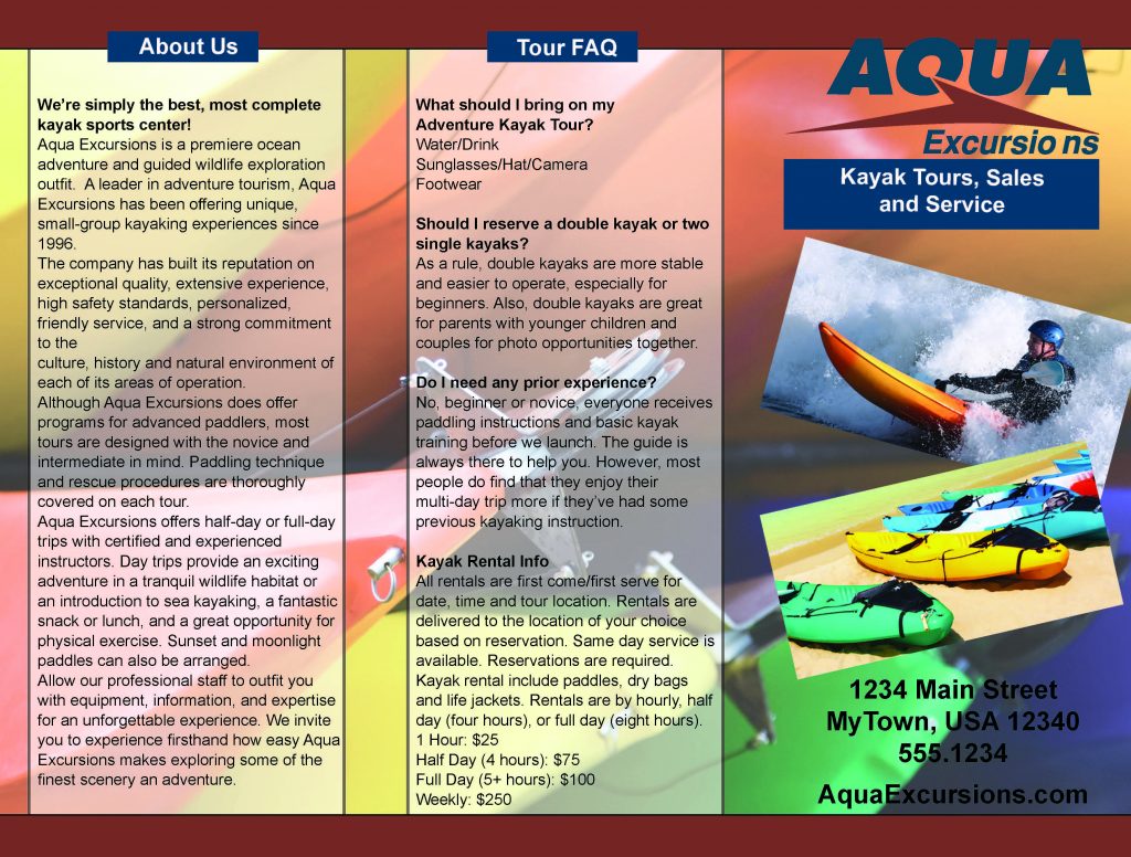
Aqua Excursions contacted me to redesign their pamphlet. Like previous jobs, I was given the information that needs to go into it. Along with the necessary information, I was given a few photos and a raster image of their logo. My first instinct was to jump into the redesigning of the pamphlet, but there were a few things I needed to do first. In order for me to use the logo reliably, It was going to have been converted into a vector. On top of this, some of the photos were not the right size. In the prosses of resizing the images, I saw that some could not be resized without the loss of quality. Consulting with Aqua Excursions, I resized the pictures that were needed for the brochure. I also sat down and read over the information they gave me to put in the booklet. I need to see if there were any spelling errors I could catch. Later on, l ran it through Grammarly.
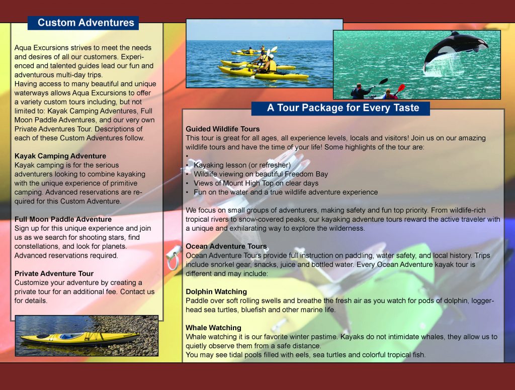
The colors I have chosen were chosen to suggest the mood of an of a quiet evening, that moment between sunset and nightfall. I felt that it was the best image to suggest a “quiet moment for you and the family.” I wanted the pamphlet to catch a person’s eye from across the room, not accosted them. My goal was to suggest some of the activities and sights that their guest may enjoy during their stay.
Finding the right balance between the images and the words was a little challenging. I did just want to place the pictures along the top and bottom like every other pamphlet. I was laying out the information a way that flowed naturally again, not wanting to over while the reader. I enjoyed working on this project. Having to think about how to best lead the reader’s eye while being informative was fun.