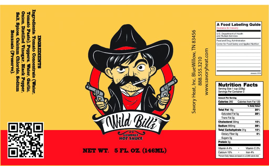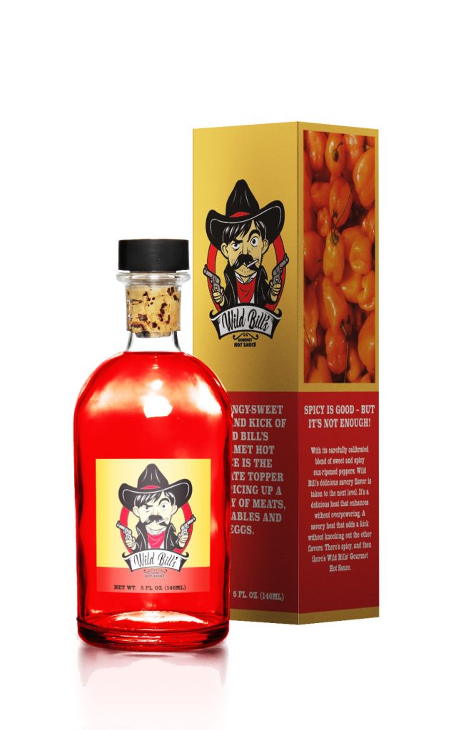
When I got the Wild Bill hot sauce, all I was given was a black and white outline of the log and some instructions. The first thing I did was convert the logo into a vector version. This would allow the Wild Bill logo to become more without losing resolution. Taking into account the natural colors for the logo, I got to work on building a mood board. I wanted to find colors that felt like an old western. The Wild Bill logo had a slight Clint Eastwood feel. I did not see any reason why I should not build on that. Some of the images I gathered for the mood board were of the ingredient. I did not think of it at the time of collecting the photos, but I realize that I could use some of the images on the packaging. An earth-tone tan seemed like a natural choice in hindsight, but trying to steer away from the obvious can be a problem within itself. It can get a little frustrating, wanting the product packaging to look natural but not get lost on a crowded shelf. I think part of the struggle is not wanting your work to feel like everybody else. Balancing your artistic flair with what the product calls for and need can be a constant act of steering and re steering the ship.
There is also the necessary information that goes on every label. I was given a website where I could find a list of what needed to be on the label, and the company provided me with the other information that needs to be on the product packaging. There is a need to concede the proper spacing between information and logo. It’s easy to think of throwing everything on the paper, and it should be fine. To close, and the information will blend in with each other. Also, keeping things aligned helps product packaging flow smoothly.